Written by Mark Coulstring

What is Data Visualization?
Data visualization is the graphical representation of data. Creating a visualization of the data helps identify relationships, patterns, and key trends that might go undetected in a text-based format.
Importance of Data Visualization
Data visualization has become a key element in BI, which involves technological processes that analyze data and convert it into useful information. It has changed the way that people look at data. Data visualization tools have made it possible for the population to more easily understand data and analytics.
This technology has made it possible for businesses to use data-driven insights to make more informed decisions. The ability to visualize data outweighs the challenge of deciphering text-based results, which has increased the adoption of this tool across a number of different industries.
This also benefits professionals who are regularly tasked with digesting large amounts of data or need to easily convey findings/results to their target audiences. Data visualization is able to make a technical analysis more engaging by using visual storytelling.
“Data visualization is probably one of the most important and sometimes poorly used tools for anyone trying to concisely provide context across large and often disparate data. With users needing comprehensible take-aways from large data analysis, visualization can add deeper context and informed knowledge in small and valuable viewport real estate and much more quickly than dry data or even longhand analysis.”
-Kraig Hamady | General Dynamics Information Technology
How Does Data Visualization Work?
Data visualization tools can pull data from multiple sources and they visually represent the data in a graphical format. Data visualization software allows users to choose the way they want to display their data, by using a bar graph, pie chart, or line graph for example. Some automation tools can identify patterns within data and present them in a visual format.
Different Types of Data Visualization:
Data visualization can appear in different visual formats, though it is important to note that data visualization is not a good fit for all data.
Temporal
- Data visualizations are temporal if they are linear and the primary dimension is time
- The data has a beginning and end time
- The data may overlap each other
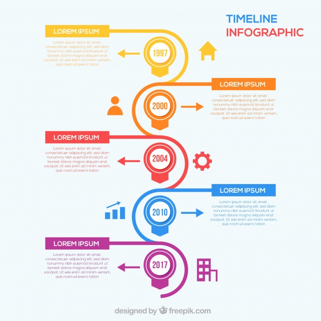
Image by: Freepik
Examples of temporal data visualization:
- Timeline
- Time series chart
- Scatter plot
- Line graph
Hierarchical
- Hierarchical data roots from one origin point
- The tree diagram is generally used to show the “parent” and “child” nodes where the main category stems into subcategories
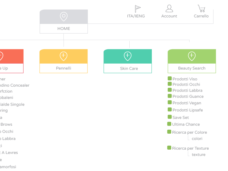
Examples of hierarchical data visualization:
- Tree diagram
- Dendrogram diagram
- Radial hierarchy or sunburst diagram
Network
- Network data visualization shows the relationship between datasets in a network

Examples of network data visualization:
- Node-link diagram
- Word cloud
- Matrix chart
Multidimensional
- Includes two or more components to create a 3D visualization
- Can pinpoint key details from a mass of data

Examples of multidimensional data visualization:
- Graphs involving numerical data.
- Histogram
- Bar graph
- Scatter plot
Geospatial
- Visualizing geospatial data
- Application of data points to maps of real-life locations
- Aids in the decision-making process and data exploration
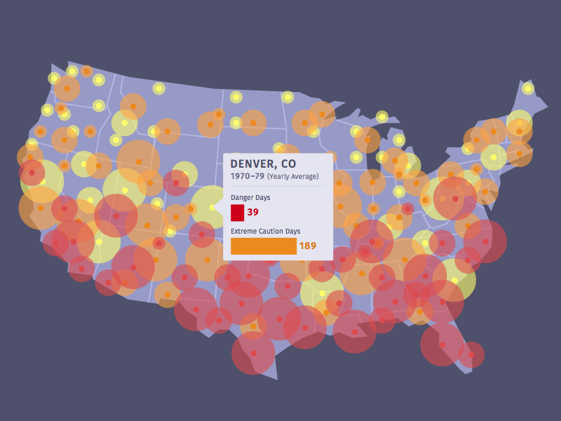
Examples of geospatial data visualization:
- Heat map
- Dot map
- Cluster map
- Cartogram map
- Chloropleth map
Companies that have based their companies upon data visualization include:
Tableau
- Tableau promotes its visual solution for analyzing data without relying on the IT department. This way, users can find their data more quickly and have confidence in their data evaluation.
Looker
- Looker is a site that helps users create a visual representation of their data in the most effective manner. It guides users through the process step-by-step.
Clear Analytics
- Clear Analytics takes a user’s data and with its BI (Business Intelligence) elements, it composes a Microsoft Excel sheet that displays data in a visual format.
Power BI
- Power BI uses data visualization tools to give users an overall view of their business. It analyzes accounts inside and outside the company and shows what data is most important in making a business more successful.
IBM Cognos Analytics
- IBM Cognos Analytics translates a user’s data into multiple visualization options to show either the differences or relationships that exist between the analyzed data.
Overall, data visualization is an important tool that helps to simplify data. By translating data into a visual representation, data visualization can illustrate related trends or patterns that could have gone unnoticed in text-format. Data visualization is also more engaging than text, which makes it a more appealing way to present your data. If you have any questions about data visualization, feel free to reach out to us at hello@seamgen.com.