Written by Mark Coulstring

Friction in UX design is when something in the design slows the user down or makes it hard for them to accomplish their task. This can be a pop-up advising a user to sign up for a newsletter, an empty state page, or an “Are you sure you want to delete this” message. Although this sounds like a bad thing, in some cases, it can actually improve the user experience. Friction can increase cognitive load to improve the outcome of actions.
When used improperly, friction can hinder the customer experience and sometimes cause users to abandon a site. For example, if users are leaving items unpurchased in a cart you should make sure that it’s not a hassle to go through the checkout process. Use friction when it’s necessary for user’s best interests. Friction in UX design can be beneficial for extra security reasons and when users are about to complete a serious action.
Friction to Confirm Actions
Friction is beneficial when a nonreversible action is about to be completed. It functions to warn the user that they are about to perform an action that has consequences. This makes it hard to do something by mistake.
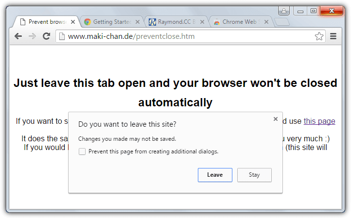
For example, when you’re in a browser such as Chrome and you want to close out of an application, a pop-up asks, “Do you want to leave this site?” This is to help you by making sure you don’t accidentally discard some work or data. If an action is extremely severe, you might need to type in a specific command to go through with it.
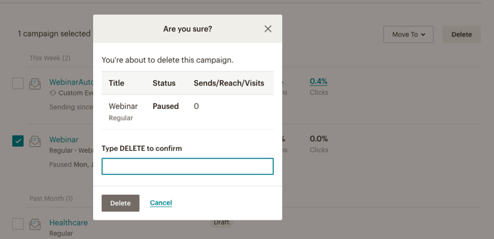
On MailChimp, an email marketing service, if a user wishes to delete an entire email campaign, they must type out the word ‘DELETE’ before successfully eliminating the campaign. Such a severe action is typically appropriate for something that requires multiple steps or large amounts of work.
Friction to Validate Actions
Friction allows users to validate what they’re about to do. It’s a prediction of a possible error on the user’s end.
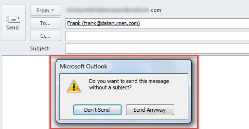
For example, before sending an email without a subject line, your email domain might warn you that there is no subject and it gives you the option to “send anyway” or fix it.
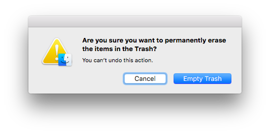
Another example of friction to validate actions is when your system dialog asks you to confirm permanently deleting items. A pop-up will allow you to continue deleting the item or canceling the action.
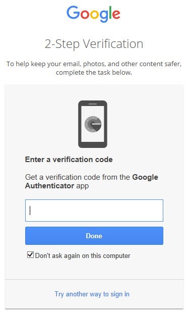
Friction to Improve Authentication
Friction in online shopping helps prevent any accidental transactions. This allows users to feel in control and reflect on the purchase they’re about to complete. Certain transactions or logging into some accounts might require an additional authentication. This contributes to the user experience because it adds a layer of protection.
For example, Google accounts give an option to turn on a 2-Step Verification process where you sign into your account with your username and password and then enter the six-digit code that gets sent to your phone.
Friction to Distract Users
Sometimes when a process requires more loading time than usual, friction can be incorporated to distract users as the page loads.
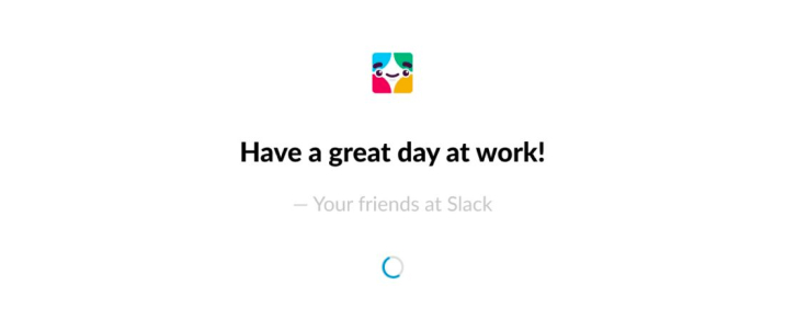
For example, as Slack loads, a pop-up with a built-in or customizable quote appears. Messages like these are meant to engage the user and make the loading process a more user-friendly experience. Loading indicators also assure users that it shouldn’t be long before they’re redirected.
It’s important to make sure that friction in your UX design isn’t frustrating or unnecessary. Implement friction when it contributes to the overall user experience. If you’re unsure whether you should have friction in any part of your UX design, we can help! Our UX designers can help you leverage friction as an efficient design tool. Contact us today if you’re interested in learning more about the importance of user experience design.