Written by Mark Coulstring

If you were given another scoop of ice cream immediately after you finished the first, would you say no? Probably not, unless you’ve got some crazy will power! It’s much easier to say yes to something once you’ve already been completely immersed by it. By having the ice cream offered to you immediately after finishing the first, you’re much more likely to eat it. Nothing beats that instant satisfaction.
Do you ever find yourself watching way too many episodes of your favorite show? It’s because video streaming apps are amazing at reeling you in for more! Video streaming apps taunt you just like a scoop of ice cream. Watching just one episode never seems to be enough. How can you say no to one more when it starts in 10 seconds. After all you are dying to see what happens after they left you with a cliffhanger. These video apps know how to leverage a clever and creative UX design to keep your eyes glued to the screen.
The UX design features that keep you engaged
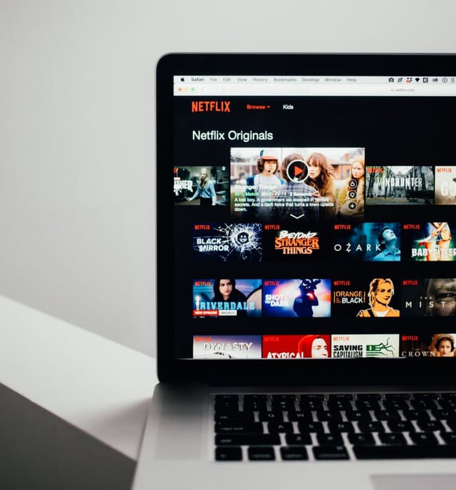
Home Screens
Video streaming apps know they need a desirable browsing design to keep you engaged. That is why the home screen is laid out with stimulating movie posters and easy navigation. The design is meant to play a strong influence when it comes to finding your next binge worthy show.
Personalized suggestions
Personalized suggestions do the legwork for you by narrowing down your search based on ratings and previously watched shows. You don’t have to look far for these suggestions as they are placed conveniently at the top of your browsing library. Netflix and Amazon Video use categories like “Your Recommendations” or “Because You Watched: (Insert Movie Title)” to show movies within your interest. Video streaming apps know they can leverage these interests to help you choose what to watch next, ultimately keeping you on their app for a longer period of time.
Content Previews
Easy access to previews and video details on the home screen can limit the time you spend browsing and increase your time binge watching. Netflix offers a quick preview with a display of icons right below the header image. These icons look similar to “Instagram stories” and show a 45 second clip of the video. Once a preview has finished you are taken right to the next clip and so on, turning your browsing experience into a binge watching session of movie trailers.
Since these “stories” are only for Netflix Originals a quick way for you to see video details on other movies thumbnail is by long-clicking them. This will open a small overlay window containing the details of the video. Once released, you’re right back where you left off, making the selection process easy and convenient. Their simple yet thoughtful designs keep you engaged by making it easy to continue watching your favorite show!
Video Profiles and Player Interfaces
After selecting your desired tv show or movie, you are taken to its profile page. The profile includes a short description about the video, its ratings, a list of episodes and more. However, you cannot actually see the information without scrolling or going to a different tab.
Why you ask? How did information on the screen go from plentiful to limited? Amazon, Hulu and Netflix all take advantage of your movement down the conversion funnel by covering half your screen with a play button. With a design like this they want to guarantee your next move is nothing other than playing that video.
Once you press play, you’re introduced to the player interface, which has a minimalist design. There is a reason for this! Too many features become distracting, and increases the likelihood of you leaving the app. Video streaming apps provide just the right amount of options to ensure that you continue to enjoy your show. Player interfaces on Netflix and Hulu only contain simple functions such as play, pause, rewind and subtitles.

Post-Play Experience
The most influential factor to your binge-watching habit is the post-play experience. Before the shows credits can even end you are being teased with a screenshot from the next episode. You don’t even have to reach for the remote as Netflix and Hulu will play the next episode automatically. Just as you think your about to get out of your binge you are drawn back in. This clever but cruel design keeps you curious and deeply engaged.
Video streaming apps invest in quality UX design because they know it pays off. Netflix reached 125 million subscribers worldwide in their first quarter in 2018 and Hulu reported 20 million in the United States. Just behind social media apps, video streaming apps capture one of the largest portions of the app market. The UX design may not be the sole reason for these numbers but it sure is a major contributor.
THANKS FOR READING!
If you’d like to learn more about tech and the latest trends, check out our other posts and subscribe to receive weekly blog updates. To inquire about any custom application design or development, please contact us.