


Written by Marc Alringer

A website is the digital face of your business. The importance of having a functional, up to date and user-friendly website has long been established. If you are in the market for a new website or are looking to improve an existing one, it’s important to understand the options available to you. Once you are familiar with the different web design styles, you will be able to make an informed decision.
User experience should be a key factor in the decision making process regarding your website design. You should be aware of your primary users and their online behaviors. How are these users going to access your website? Do they spend more time on a desktop computer or do they prefer a tablet or mobile device? Users expect a seamless experience regardless of the device they use. Understanding your users will help you better serve their needs. The proper web design can drastically increase the length of time users stay on your platform and can lead to higher conversions.
Responsive Web Design
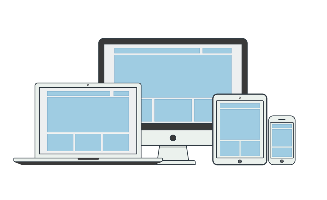
Responsive websites will automatically resize to device screen size the website is being viewed on. This web design style uses media queries that allow CSS styles to adapt to different screen sizes.
When this is done correctly, the user experience will be seamless. Responsive design is fluid and page elements flow smoothly as the browser size is changed. It enables a user to visit your website on their computer, tablet or mobile device and always encounter a uniform user experience.
Arguably the most important benefit of responsive website design is that it improves your SEO rankings. Something to be cautious of, however, is the possibility of varying download times between desktop and mobile devices. Website speed influences the user experience, so this has the potential to negatively impact your viewers’ overall impression.
Adaptive Web Design
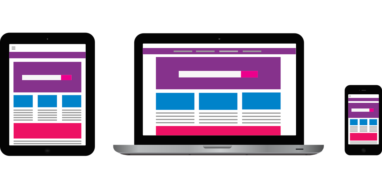
In contrast to responsive web design, adaptive web design requires you to design for various screen sizes that will adapt to fit the appropriate viewport. Where responsive web design is fluid, adaptive web design is more static and content tends to snap into place.
Adaptive websites offer more control over the website design because the designer chooses a specific layout for each device size. Unlike with responsive design, elements on an adaptive website do not move.
This style of website generally requires more time and resources. The software development team must design and develop multiple website sizes for all the different devices users may own.
Adaptive websites may have a negative impact on your SEO rankings. Search engines will likely interpret the various versions of your website as duplicate content. It can be difficult for search engines to determine which version is more relevant to a given search.
“Responsive and adaptive designs are the same in that they are methods for dealing with the reality that websites are often viewed on different devices in different contexts. They just happen to go about it in their own ways.” -Geoff Graham
The differences between responsive and adaptive web design can get confusing, but when deciding between the two it ultimately comes down to the needs of your business.
Responsive websites are more suitable when your objective is to create an entirely new website. This style will ensure that the website you create will work on any device type, even those that have yet to be released. Adaptive websites are useful when you are looking to make an existing website mobile-friendly. You can access website analytics to determine which devices your users primarily use and design for those specific screen sizes.
Every business is different and certain situations will call for one type over the other. Responsive web design is more universally supported, while adaptive web design provides the best user experience for each specific device type.
Understanding your users and their online behaviors will help you create a website that upholds your positive digital reputation. If you are unsure of where to start, contact us for a free consultation. We are more than happy to help!
