Aldera
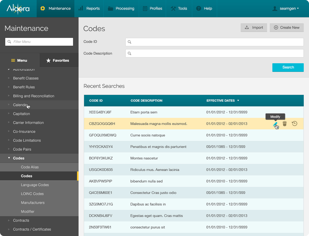
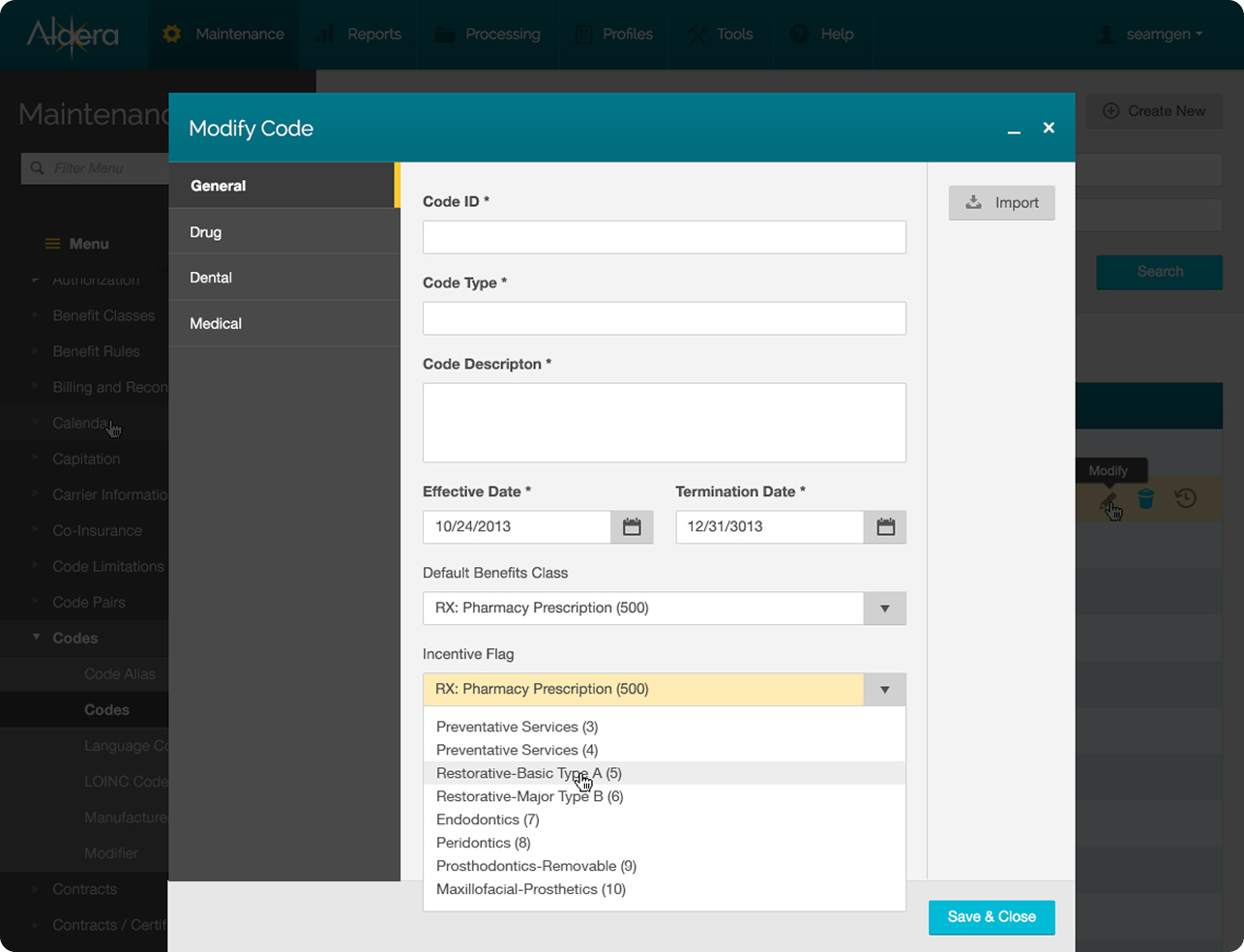
The complex business of healthcare in a simplified platform
The Challenge

Streamlining a Complex Healthcare Platform

Aldera's existing platform, with over 500 pages of dynamic content and an extensive feature set, struggled to provide a user-friendly experience. While it supported a broad range of functions from customer service to creating benefits plans, it lacked the simplicity and flexibility needed to meet the demands of users across multiple payer brands. The challenge was to design a solution that could simplify complex workflows, improve usability, and ensure seamless integration across various devices while maintaining support for multiple insurance types and user segments.


maintenance_0000_default

Simplifying healthcare workflows—because navigating 500 pages shouldn't feel like a maze.

The Solution

Simplified Design for Improved Usability

Our solution involved redesigning Aldera’s platform to create a more intuitive, user-centric experience. We focused on streamlining the interface, reducing complexity, and enhancing functionality across a wide range of users and brands. By developing a flexible, white-labeled interface, we ensured that it could adapt to different payer needs while maintaining a consistent user experience. Detailed wireframes and thorough user testing laid the foundation for a robust prototype, which led to improved task efficiency and user satisfaction. The result was a responsive, easily navigable healthcare portal that improved overall usability and performance, making it easier for users to access the information they need across devices.

maintenance_0002_dropdown menu

A redesigned, user-friendly healthcare portal for Aldera streamlines complex workflows with a clean interface, flexible layout, and intuitive navigation

RESEARCH & DISCOVERY

Understanding the Good and the Bad

Aldera’s existing product had over 500 pages of dynamic content and a seemingly endless feature set -- capable of doing everything, from handling customer service to creating company benefits plans. In order to improve this robust application, we needed to begin with gaining a more complete understanding.

Insights That Shaped the Redesign

The platform’s search functionality was a standout strength, offering highly granular filtering and thorough results. However, the interface suffered from confusing labels, inconsistent logic, and a steep learning curve. These findings helped guide our approach: maintain the platform’s powerful capabilities while making it more intuitive and accessible for all users.

WIREFRAMES

Detailed and Comprehensive Wireframes Laid the Foundation for a Robust Prototype

As we built the system for the user interface, we made assumptions about the users’ behavior and the information they might need at any given time. For something as general as a healthcare member portal, the design needed to work for any number of user types. As a result, design languages needed to work not only for specific user segments, but also for any number of brands as well.

maintenance_preview

Our wireframes are designed to support a wide range of healthcare users and brands while keeping navigation and usability consistent

USER TESTING

Capturing Input from a Broad Demographic was key to Useful Feedback

Utilizing a combination of virtual and in person testing, we created a task-based test to analyze the efficiency of the overall experience. A healthcare portal needs to be direct, obvious and informative; most users just want to get the information they need and move on. For these reasons, we tracked specific feedback from users that improved overall time on each task.

Example task

After moving to a different city, you and your family are in need of a new primary care physician. Dr. Rick Zonda is a highly rated primary care physician within 5 miles of your home address in 92101. Find Dr. Rick Zonda and select him as your primary care physician for all members of your family (The Ross family). 

How We Improved

  1. +20%
    Increase in Efficiency
  2. +92%
    Would Recommend the Experience
THE RESULT

The Design Needed to be Flexible to Accommodate Multiple Brands, Users and Insurance Types

Hundreds of screens across multiple device sizes resulted in a flexible framework for all. Here’s a small sampling of key screens from the overall experience. Want to see more? Get in touch.

Desktop Screens Tilted Collage (3) (1)
Not Convinced Yet?

We’ve got more great projects

WEB
Brain Corp
WEB
Include FItness
FEATURED
Blue Shield

Do you need a custom software development partner?

Let’s discuss your modernization strategy and digital application goals.

SBA Certified

We’re a SBA Certified Small Business

541511

Custom Computer 

Programming Services

511210

Software 

Publishers

541512

Computer System 

Design Services

541513

Computer Facilities 

Management Services

541519

Other computer 

related services

Close Icon

Fill out the form and we’ll get back to you ASAP.